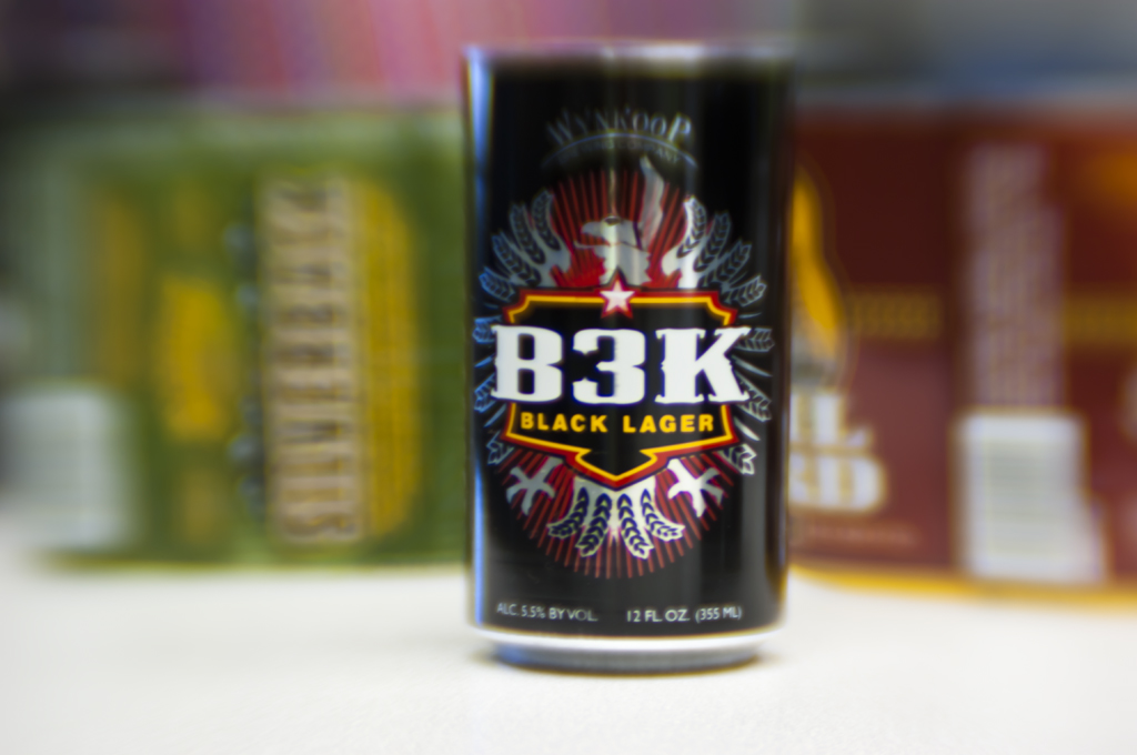

The Wynkoop logo has come a long way from the brewery’s start in 1988. In the early 1990s, the logo was simplified to just the main type. While it was abig step in the right direction, there were still major issues with the logo. By 2013, people had taken to calling this the “frowny face logo” because of its prominent downward curve. The logo also had typographical issues including a dated and overused font, super fine lines, misalignment, and more. The mark was not working well in small sizes on cans and this became a big problem as the Wynkoop emerged as a leader in the canning movement.

With so many microbreweries starting up, the Wynkoop Brewing Company felt the need to reposition and update the brand so they wouldn’t be written off as the stodgy old brand. However, they were proud of their history as the first craft brewery in Denver, and wanted to embrace that.
That’s when Pattern was brought in to help. Logo comps were started in early 2012. With the main concept of the logo redesign as “urban cowboy,” it was important to them to include some sort of texture. They needed to feel organic and not computer-generated.

Early font explorations.

Early mark explorations.

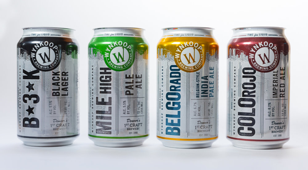
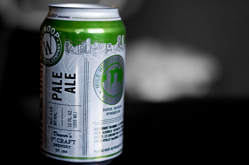
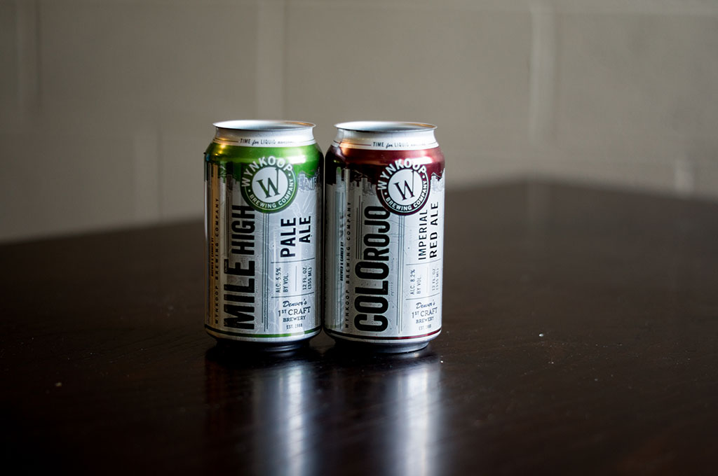
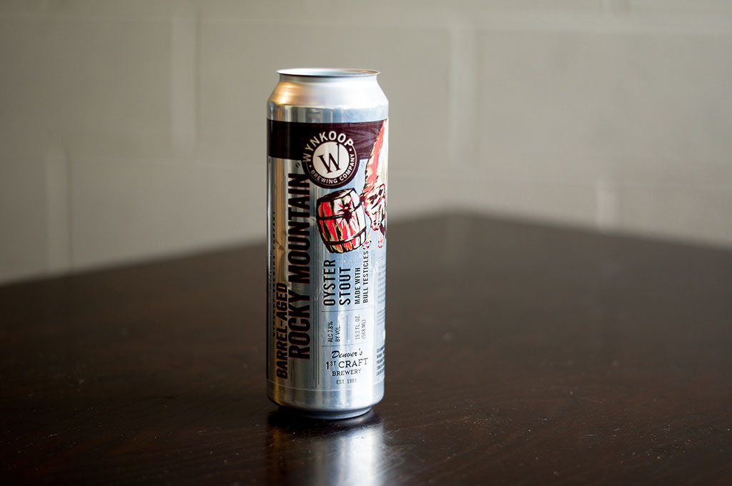
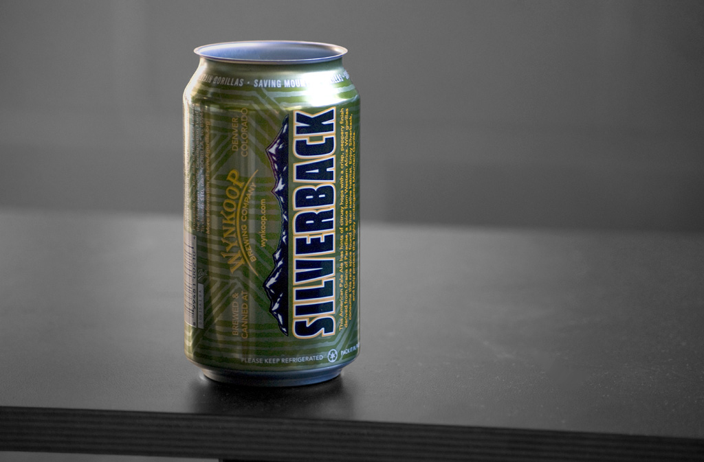
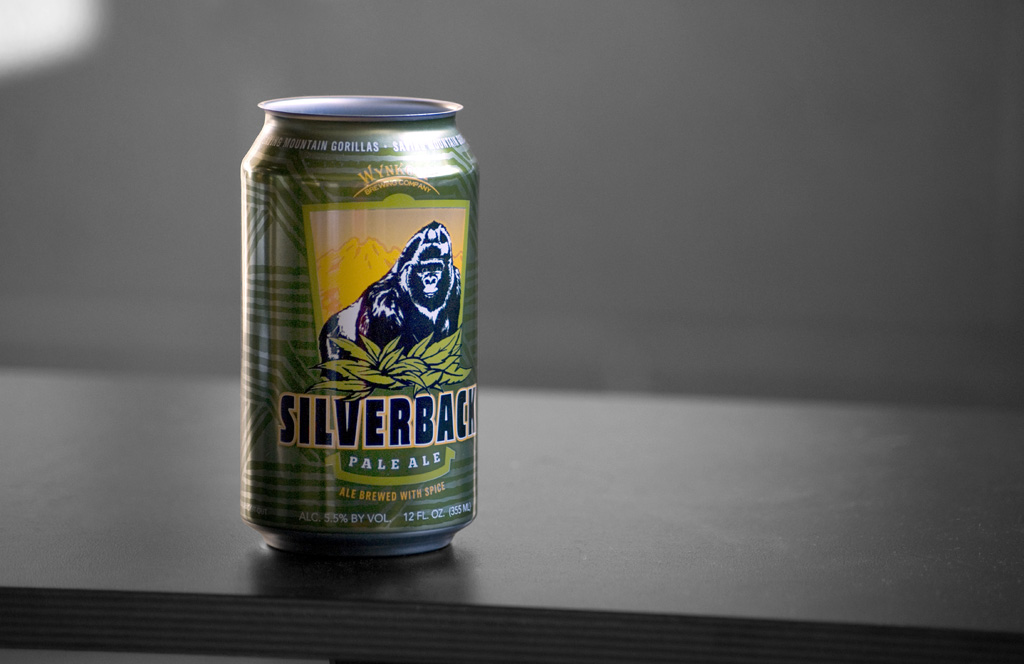
The winning mark was this use of the timeless sans-serif Trade Gothic, married with the old Algerian font W. The W in the new mark actually keeps the same angle as the type set of the 1988 logo, though the hairline shadow has been dropped and the form has been tweaked to be a little more graceful. This was a great tie in with the original brand that Denver beer drinkers were familiar with. An organic, grunge texture was also applied to the final logo, ensuring a vintage vibe.
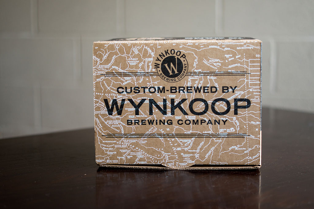
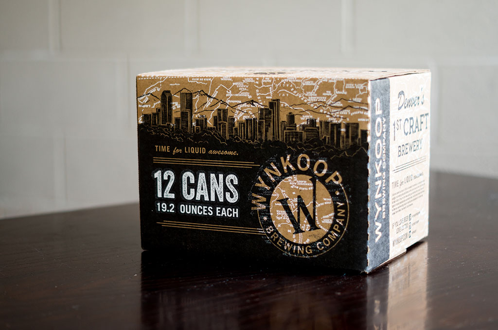
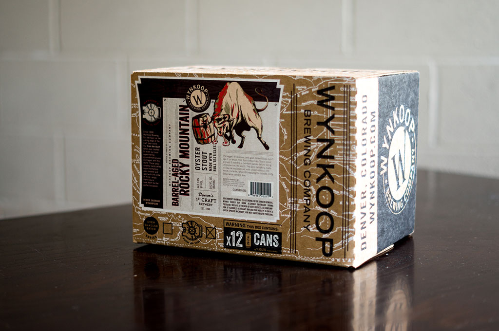
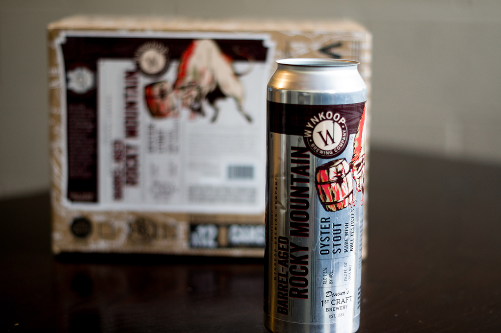
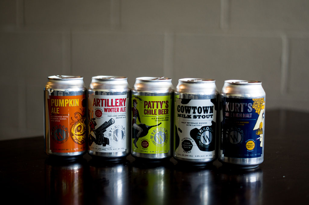
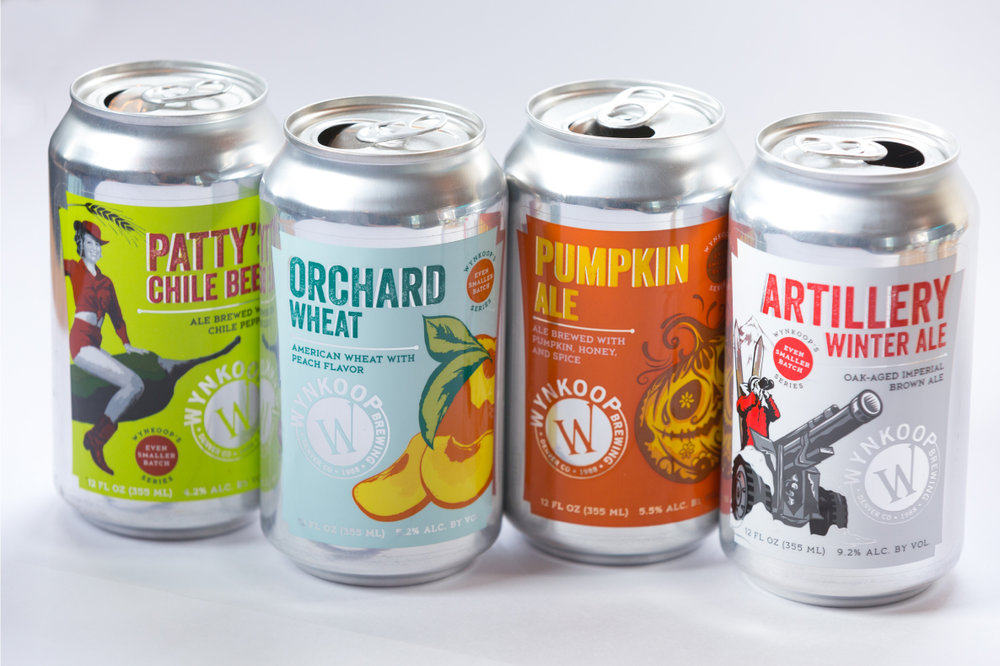
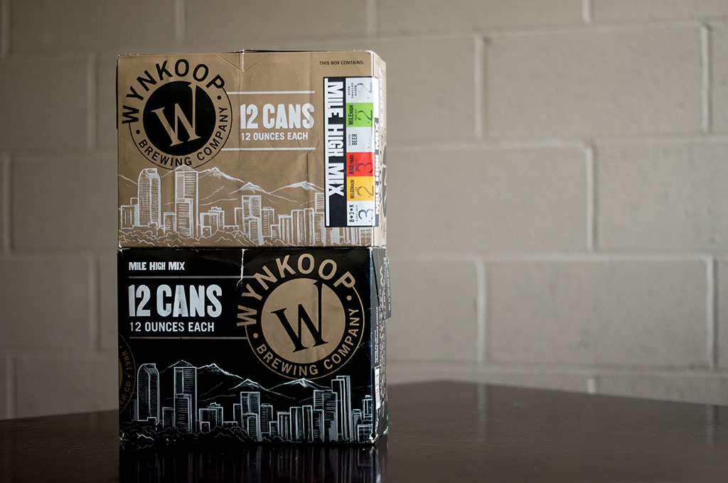
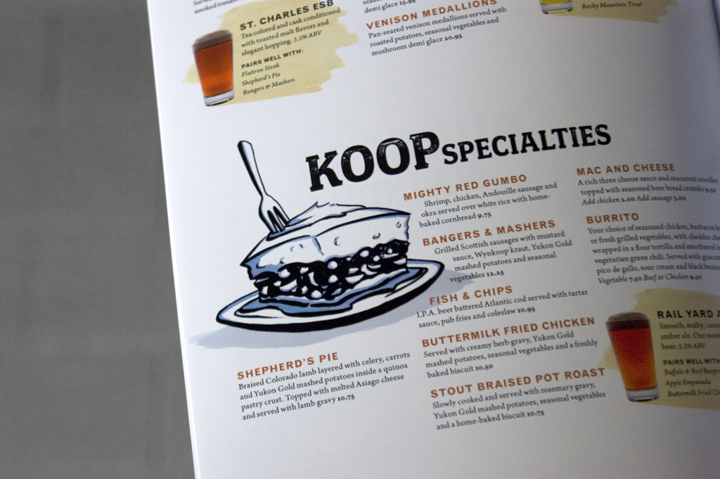
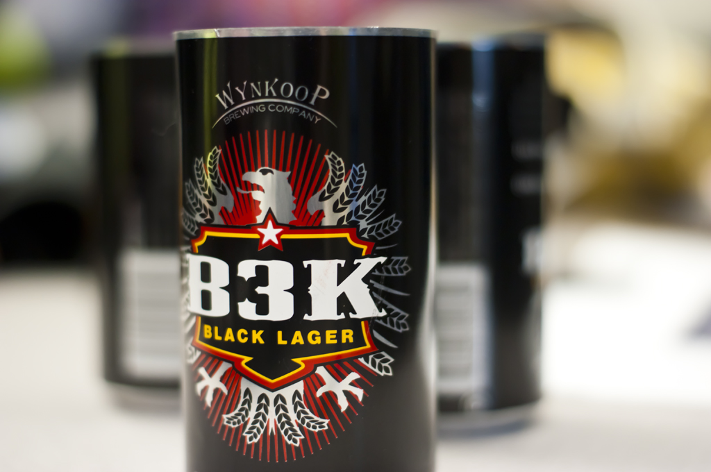
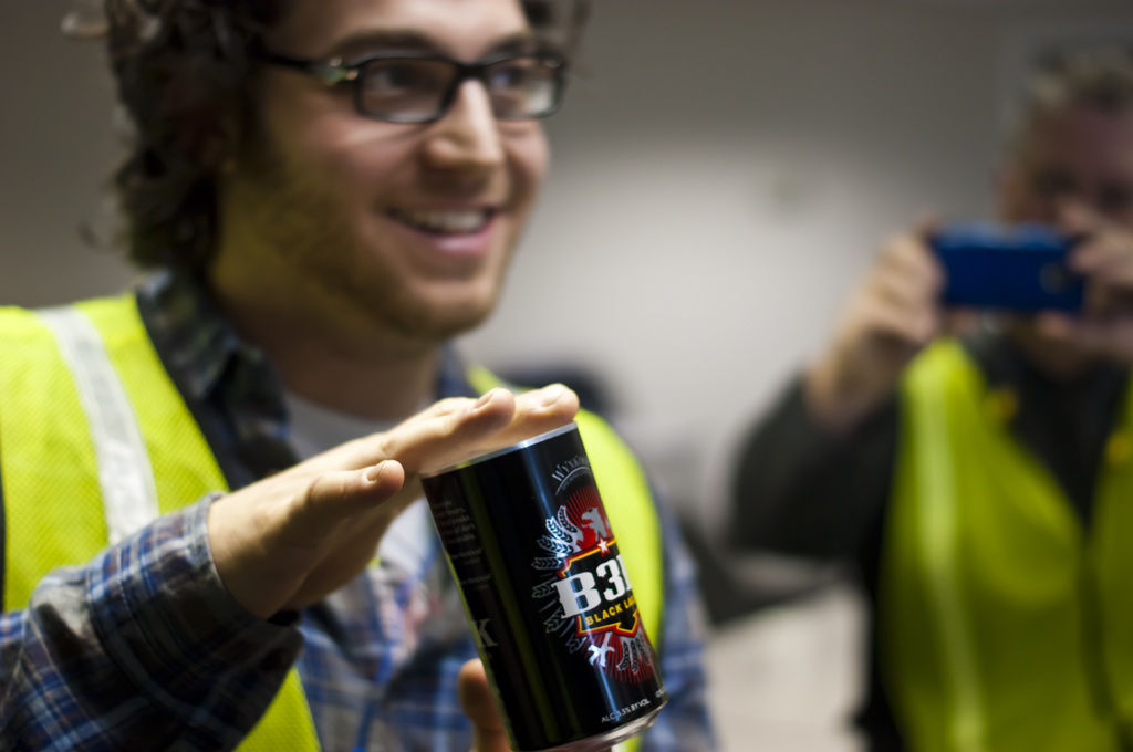
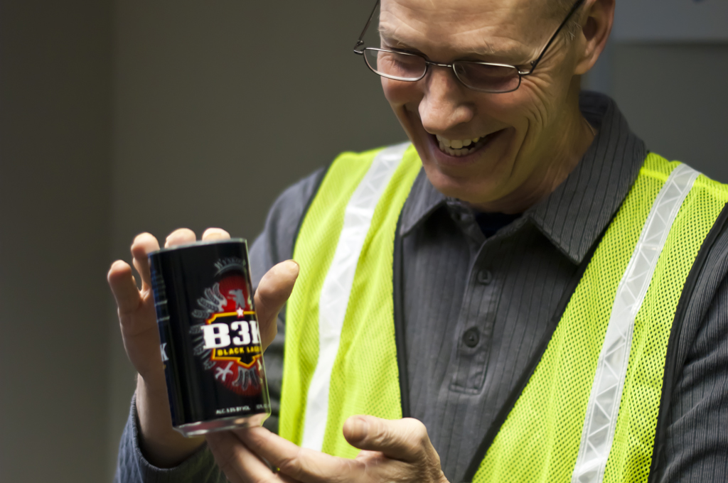
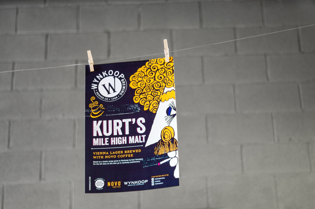
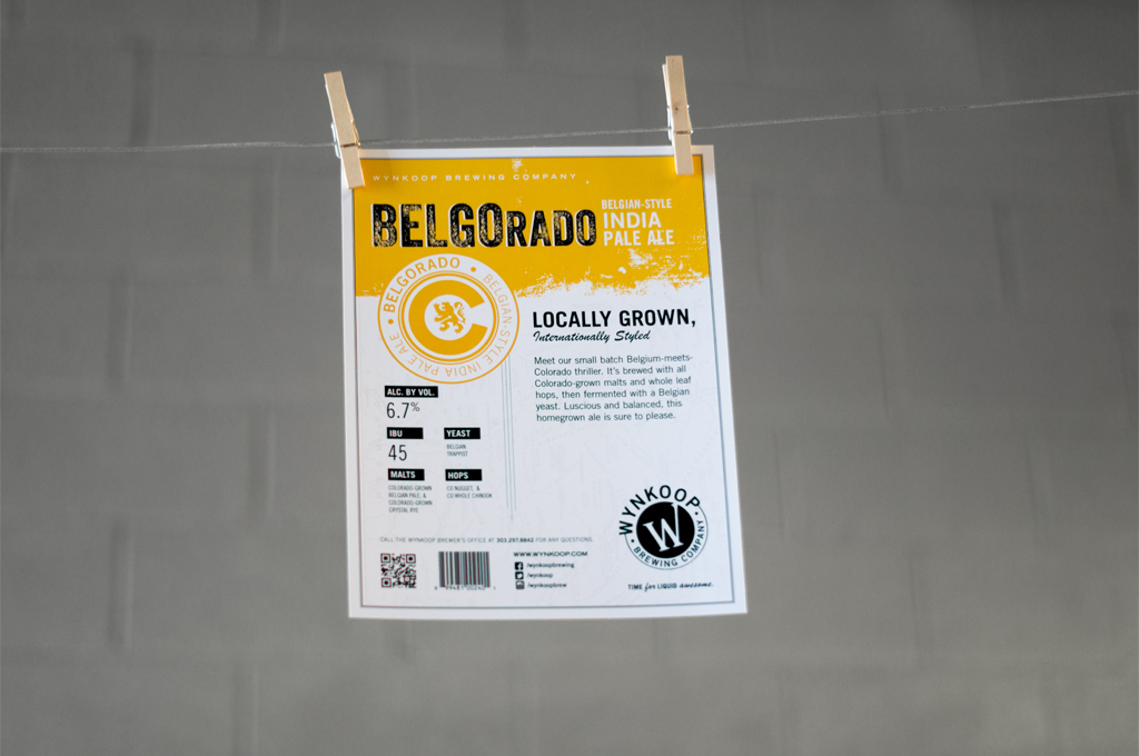
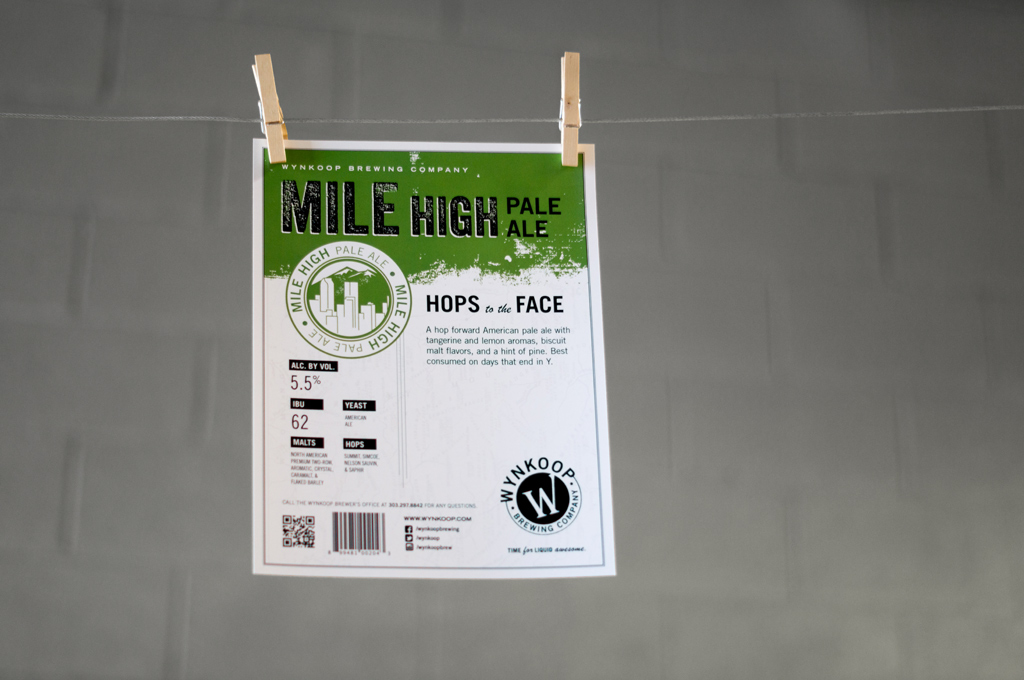
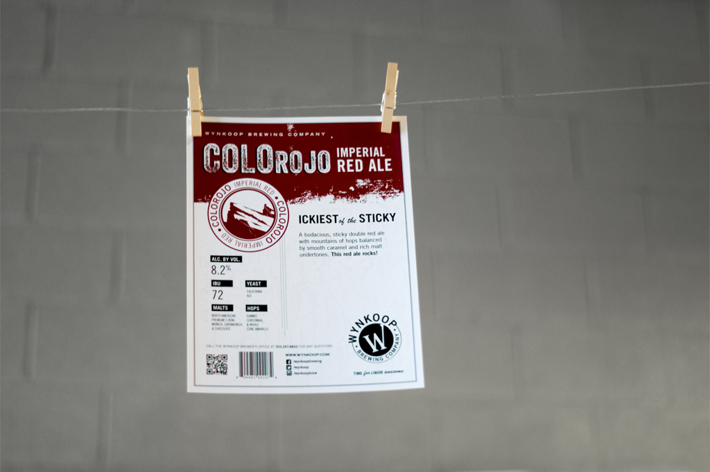
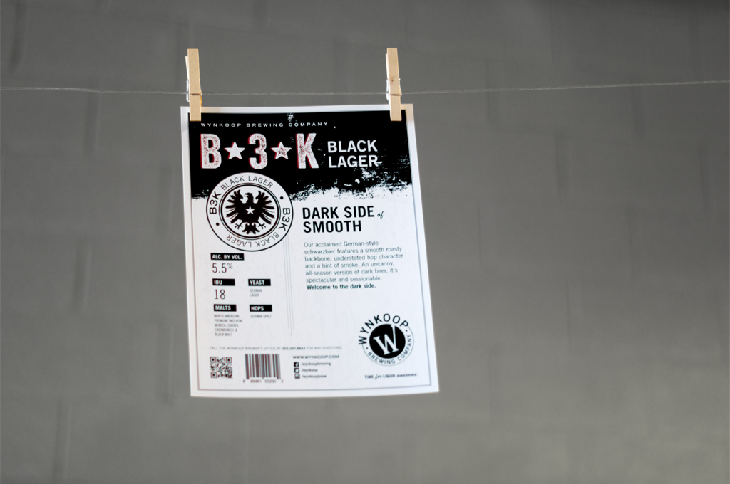
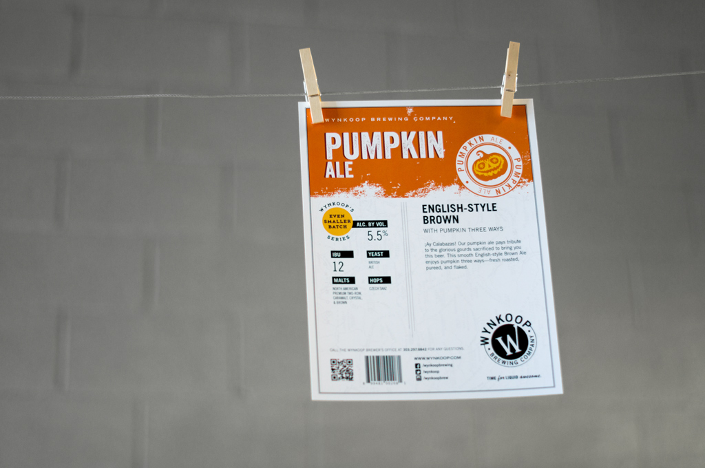
The new logo made its public debut on the 12-pack box last fall and now appears on cans, sales sheets, shirts, hats, and more throughout the Denver metro area. Pattern is proud to have been a part of this exciting brand evolution, which also includes hand-drawn illustration, historical map elements, and vintage letterpress-inspired type updates. We can’t wait to see where the Wynkoop goes next!