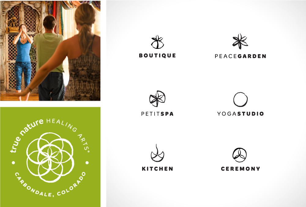

In January of 2013, Pattern was invited to Carbondale, Colorado, by True Nature Healing Arts co-owners Deva and Eaden. The main agenda of the trip was to learn the vision Deva and Eaden had for the future branding of True Nature Healing Arts. At that time, True Nature was only a yoga studio but they were in the process of remodeling the space to include a spa; kitchen; boutique; and therapeutic, beautiful outdoor spaces. It was important to the clients that the main logo and any sub brand identities had a cohesive and connected feel.

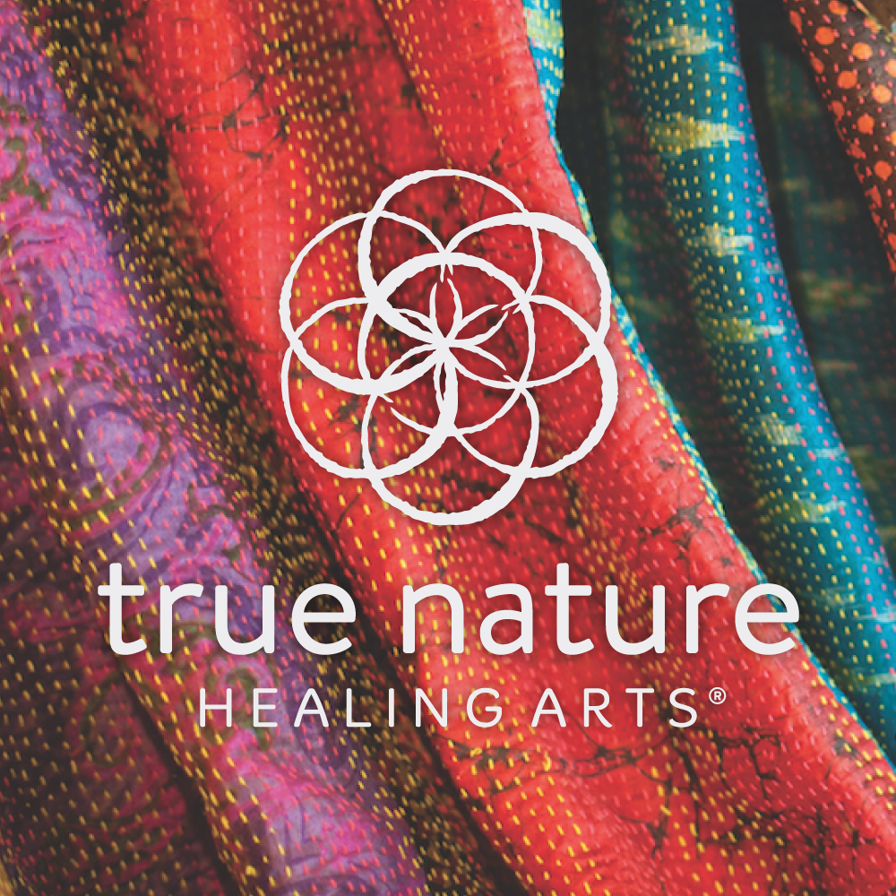
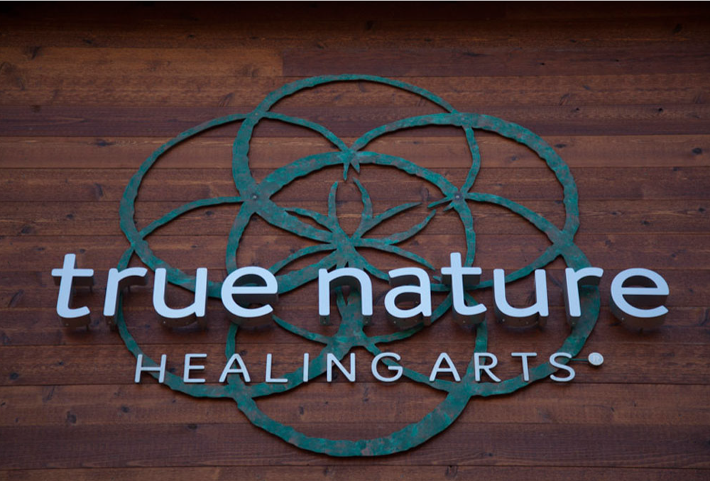
The clients liked the existing logo’s use of the Seed of Life, an ancient symbol for creation and life, and wanted to continue to use it as the main logo.

Pattern’s solution was to stylize the Seed of Life and use more sophisticated typography. Scanning in hand-drawn ink circles updated and humanized the seed. This process helped create a very natural, organic, and unique look for the Seed of Life mark.
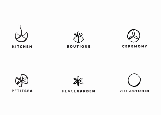
The sub brand symbols were actually made from parts of the main Seed of Life mark. This solution created a comprehensive, flexible suite of logo marks for True Nature and its family of brands.

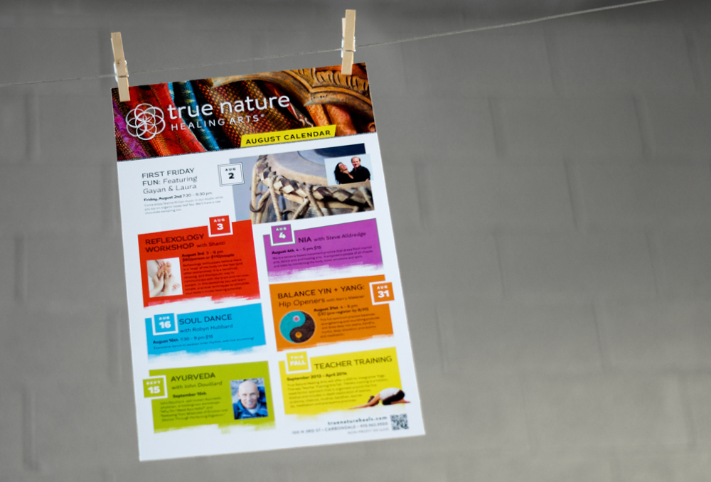
Other brand elements were also created. Pattern formulated a vibrant color scheme for True Nature. The bright, energized color scheme was inspired by the ethnic fabric drapes that are featured throughout the building.
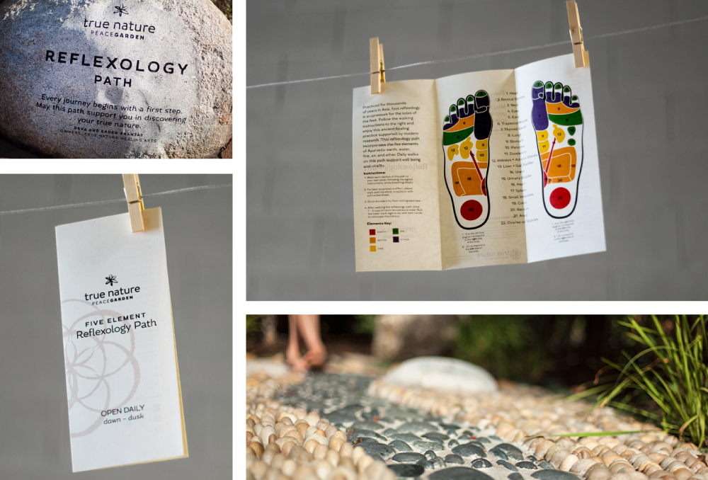
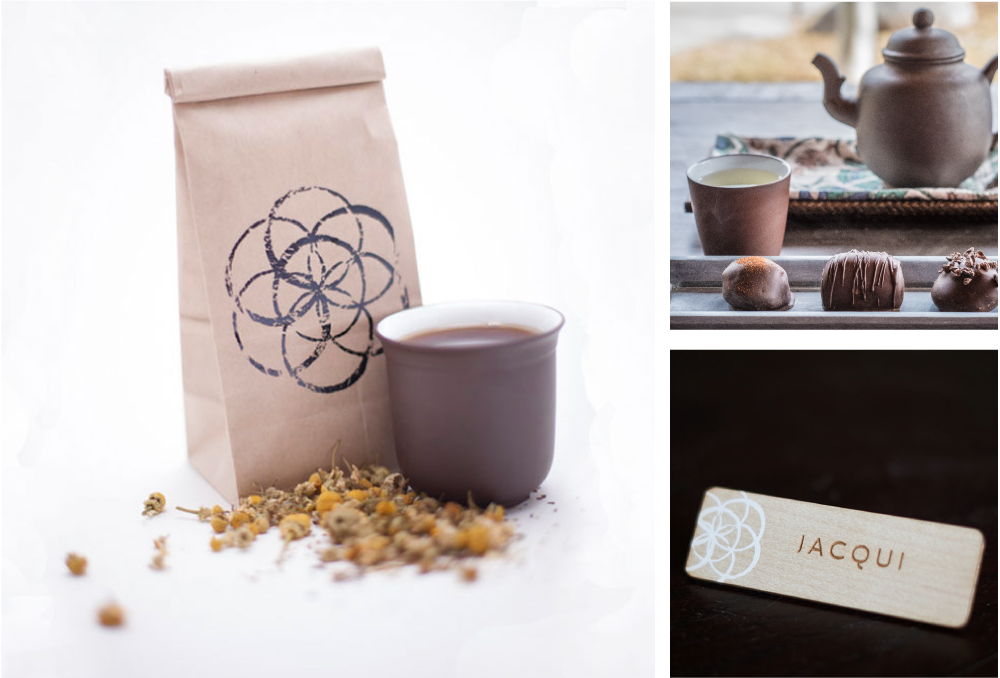
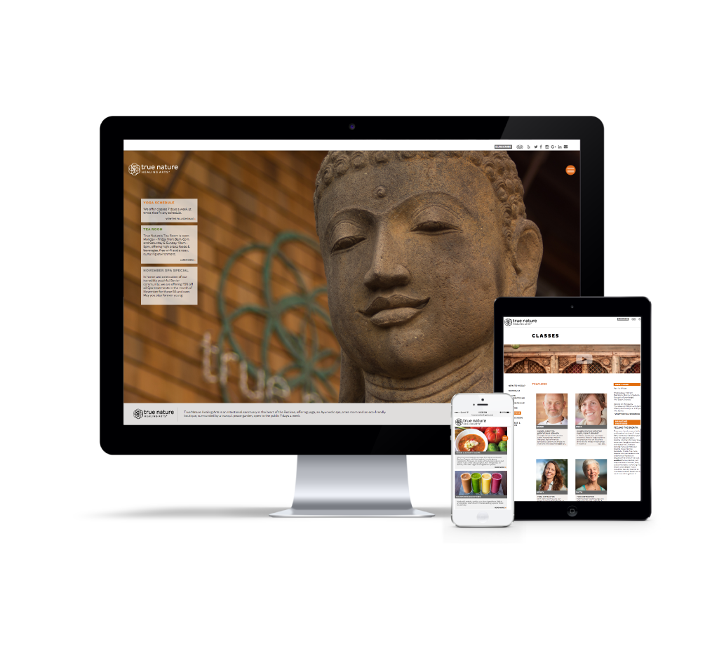
After the development of logos and color scheme, Pattern began designing coordinating signage, packaging, marketing materials, menus, posters, and a unique website. The website is home to some beautiful videos created by Chance Multimedia.